I have shared a comprehensive knowledge about CSS Rules and CSS Browser Specific Properties. Now, i am going to write tutorial about amazing, awesome and new CSS3 properties. I know, most of them are still vendor specific but their usage can enhance the beauty and usability of your projects. It is also a good reason to learn the future of CSS3.
1. CSS3 Border Radius
border-radius seems to be a hot topic these days, what with CSS3 including it and some browser vendors already implementing it. I just think it looks nice. You may be interested to know more about CSS3 border radius.
<!DOCTYPE html>
<html lang="en">
<head>
<meta charset="UTF-8" />
<title>CSS3 Border Radius</title>
<style>
.box {

	/*
	|-------------------
	| Box Style
	|-------------------
	*/

	background-color:#F00;
	color:#FFF;
	width: 200px;
	height: 50px;
	line-height: 50px;
	text-align: center;

	/*
	|-------------------
	| Border Radius
	|-------------------
	*/

	-webkit-border-radius: 4px;
	-moz-border-radius: 4px;
	border-radius: 4px;

}
</style>
</head>
<body>
  <div class="box">Box with Border Radius</div>
</body>
</html>
Output

You may also be interested to see a beautiful post about Table of CSS3 border-radius Compliance
A good news is that, both Safari 5 and IE9 implement the official “border-radius” syntax.
Circles: CSS3 Border Radius
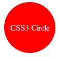
Before the introduction of CSS3, if you wanted to display your text in a circle you had to be creative using images or other techniques. The implementation of CSS3 has changed that and you can now transform your <div> into a nice round object.
<!DOCTYPE html>
<html lang="en">
<head>
<meta charset="UTF-8" />
<title>Circles: CSS3 Border Radius</title>
<style>
.box {
	background: #F00;
	color: #FFF;
	width: 100px;
	height: 100px;
	text-align: center;

	-moz-border-radius: 50px;
	-webkit-border-radius: 50px;
	border-radius: 50px;

	display: -moz-box;
	display: -webkit-box;
	display: box;

	-moz-box-orient: horizontal;
	-webkit-box-orient: horizontal;
	box-orient: horizontal;

	-moz-box-pack: center;
	-moz-box-align: center;

	-webkit-box-pack: center;
	-webkit-box-align: center;

	box-pack: center;
	box-align: center;
}
</style>
</head>
<body>
<div class="box">
  <div>CSS3 Circle</div>
</div>
</body>
</html>
Output

2. Box Shadow with CSS3
The box-shadow property allows designers to easily implement multiple drop shadows (outer or inner) on box elements, specifying values for color, size, blur and offset.
Firefox, Safari/Chrome, Opera and IE9 supports CSS3 box shadow.
<!DOCTYPE html>
<html lang="en">
<head>
<meta charset="UTF-8" />
<title>Box Shadow with CSS3</title>
<style>
.box {
	-webkit-box-shadow: 1px 1px 3px #292929;
	-moz-box-shadow: 1px 1px 3px #292929;
	box-shadow: 1px 1px 3px #292929;

	background: #F00;
	color: #FFF;
	padding: 10px;
	width: 200px;
	height: 200px;
}
</style>
</head>
<body>
<div class="box">CSS3 Box Shadow</div>
</body>
</html>
Output

The box-shadow property takes several attributes/values, like any other CSS property, and these are are specified in order as follows:
- Horizontal offset of the shadow: a positive value for shadows on the right of the box, and a negative value for a shadow on the left of the box
- Vertical offset: similarly, a negative value means the shadow will be on top, a positive one means the shadow will be below the box
- The blur radius: a value of 0 makes the shadow sharp, the higher the number, the more blurred
- Color of shadow
3. Text Shadow CSS3
text-shadow is one of the few CSS properties that we can omit the use of vendor-prefixes. Quite similar to box-shadow, it must be applied to text, and receives the same four parameters:
- x-offset
- y-offest
- blur
- color of shadow
text-shadow was included in CSS2, removed from CSS2.1 and returns in CSS3. It has been supported in Safari since version 1.1, and is supported in Chrome, Firefox 3.5 and Opera 10.
<!DOCTYPE html>
<html lang="en">
<head>
<meta charset="UTF-8" />
<title>Text Shadow CSS3</title>
<style>
body { background: #666; }
h1 {
	text-shadow: 0px 1px 0px #FFF;
	color: #292929;
	font-size: 90px;
	font-family: Arial, Helvetica, sans-serif;
}
</style>
</head>
<body>
<h1> Text Shadow </h1>
</body>
</html>
Output

4. Multiple Backgrounds
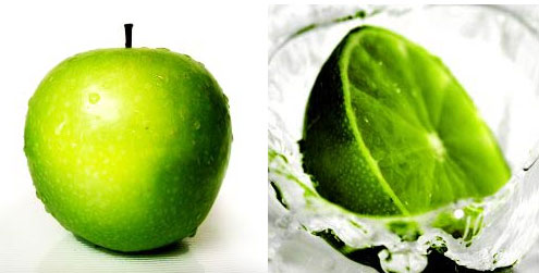
Background images / textures are being used and implemented in many ways, often adding the nicest of finishing touches to a website. It is now in CSS3 we can apply background image dimensions as well as use multiple background images.
Applying multiple background images in CSS3 is quite easy, using a comma with the standard background property.
Make sure that you provide a support for the browsers which don’t provide support for multiple backgrounds. They’ll skip over the property entirely, leaving your background blank.
<!DOCTYPE html>
<html lang="en">
<head>
<meta charset="UTF-8" />
<title>Multiple Backgrounds</title>
<style>
.box {
	/*
	|--------------------
	| Support Old Browsers
	|--------------------
	*/
	background: url(apple.jpg) no-repeat;
	/*
	|--------------------
	| Support Modern Browsers
	|--------------------
	*/
    background: url(apple.jpg) 0 0 no-repeat, url(orange.jpg) 100% 0 no-repeat;
	width: 500px;
	height :250px;
}
</style>
</head>
<body>
<div class="box"></div>
</body>
</html>
Output

5. Text Overflow CSS3
Some content in an element may fall outside the element’s rendering box for a number of reasons (negative margins, absolute positioning, content exceeding the width/height set for an element, etc.) In cases where this occurs, the “overflow” (set to “hidden” or “scroll” for this property to have an effect), and “clip” properties define what content will be visible.
If text is too long for the overflow/clipping area and the content is to be visually clipped, this property allows the clipped content to be visually represented by the string “…” (called an “ellipsis”) in the non-clipped area.
Originally developed by Internet Explorer, the text-overflow property can accept two values:
- clip
- ellipsis
Amazing: Internet Explorer has provided support for this property since IE6? They created it!
<!DOCTYPE html>
<html lang="en">
<head>
<meta charset="UTF-8" />
<title>Text Overflow CSS3</title>
<style>
#box {

	text-overflow:ellipsis;
	-o-text-overflow: ellipsis;
	overflow:hidden;
	white-space:nowrap;

	border: 1px solid black;
	width: 400px;
	padding: 20px;
 	-webkit-transition: all .5s;
	color: rgba(0, 0, 0, .7);
	cursor: pointer;
}
#box:hover {
	white-space: normal;
	color: rgba(0, 0, 0, 1);
	background: #e3e3e3;
	border: 1px solid #666;
}
</style>
</head>
<body>
<div id="box"> Lorem ipsum dolor sit amet, consectetur adipisicing elit, sed do eiusmod tempor incididunt ut labore et dolore magna aliqua. Ut enim ad minim veniam, quis nostrud exercitation ullamco laboris nisi ut aliquip ex ea commodo consequat. Lorem ipsum dolor sit amet, consectetur adipisicing elit, sed do eiusmod tempor incididunt ut labore et dolore magna aliqua. Ut enim ad minim veniam, quis nostrud exercitation ullamco laboris nisi ut aliquip ex ea commodo consequat.  Lorem ipsum dolor sit amet, consectetur adipisicing elit, sed do eiusmod tempor incididunt ut labore et dolore magna aliqua. Ut enim ad minim veniam, quis nostrud exercitation ullamco laboris nisi ut aliquip ex ea commodo consequat.</div>
</body>
</html>
Output

Thank you so much for reading, and I hoped you learned a bit!