Rounded corner effects to the blocks in HTML structure enhance the beauty of blogs and we have achieved this effect by using corner images in the past, but the CSS3 border-radius property allows web developers to easily utilize rounder corners in their design elements, without the need for corner images or the use of multiple div tags, and is perhaps one of the most talked about aspects of CSS3.
I am going to write CSS rounded corner tutorial to understand “border-radius” property of W3C along with the concept of CSS browser extensions. Let’s start with a very basic example,
Border Radius Example 1
Let’s write a html code, and style it with “border-radius” to generate a block with rounded corners.
<!DOCTYPE html PUBLIC "-//W3C//DTD XHTML 1.0 Transitional//EN" "http://www.w3.org/TR/xhtml1/DTD/xhtml1-transitional.dtd">
<html xmlns="http://www.w3.org/1999/xhtml">
<head>
<meta http-equiv="Content-Type" content="text/html; charset=utf-8" />
<title>CSS Rounded Corners Without Images</title>
<style>
.corners {
	width: 500px;
	margin: 0px auto;
	background-color: #000;
	color: #fff;
	padding: 10px;

	/* Border Radius Style */
	border-radius: 15px;

	/* Mozilla Firefox Extension */
	-moz-border-radius: 15px;
}
</style>
</head>

<body>
<!-- Begin Rounded Corners Block -->
<div class="corners">CSS Rounded Corners Without Images</div>
<!-- End Rounded Corners Block -->
</body>
</html>
Output
You have noticed “border-radius” property and browser specific extension of Mozilla Firefox in the style code. Above code will generate the following output.

Border Radius Detail
Rounder corners can be created independently using the four individual border i.e
- border-bottom-left-radius
- border-bottom-right-radius
- border-top-left-radius
- border-top-right-radius
Syntax
border-*-*-radius: [ <length> | <%> ] [ <length> | <%> ]?
Examples
border-top-left-radius: 10px 5px;
border-bottom-right-radius: 10% 5%;
border-top-right-radius: 10px;
Where two values are supplied these are used to define, in order, the horizontal and vertical radii of a quarter ellipse, which in turn determines the curvature of the corner of the outer border edge.
Border Radius Example 2
Here’s a few basic examples that should work in current versions of Firefox, Safari/Chrome, Opera and even IE9:
<!DOCTYPE html PUBLIC "-//W3C//DTD XHTML 1.0 Transitional//EN" "http://www.w3.org/TR/xhtml1/DTD/xhtml1-transitional.dtd">
<html xmlns="http://www.w3.org/1999/xhtml">
<head>
<meta http-equiv="Content-Type" content="text/html; charset=utf-8" />
<title>CSS Rounded Corners Without Images</title>
<style>
.box {
	width: 500px;
	margin: 10px auto;
	background-color: #000;
	color: #fff;
	padding: 15px;
}

.cornertopleft {
	/* Border Radius Style */
	border-top-left-radius: 30px;
	/* Mozilla Firefox Extension */
	-moz-border-radius-topleft: 30px;
}

.cornertopright {
	/* Border Radius Style */
	border-top-right-radius: 30px;
	/* Mozilla Firefox Extension */
	-moz-border-radius-topright: 30px;
}

.cornerbottomleft {
	/* Border Radius Style */
	border-bottom-left-radius: 30px;
	/* Mozilla Firefox Extension */
	-moz-border-radius-bottomleft: 30px;
}

.cornerbottomright {
	/* Border Radius Style */
	border-bottom-right-radius: 30px;
	/* Mozilla Firefox Extension */
	-moz-border-radius-bottomright: 30px;
}

.box2 {
	width: 120px;
	height: 120px;
	margin: 10px auto;
	background-color: #000;
	color: #fff;
}

.cornerall {
	/* Border Radius Style */
	border-radius: 60px;
	/* Mozilla Firefox Extension */
	-moz-border-radius: 60px;
}

</style>
</head>

<body>
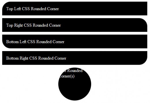
<div class="box cornertopleft">Top Left CSS Rounded Corner</div>
<div class="box cornertopright">Top Right CSS Rounded Corner</div>
<div class="box cornerbottomleft">Bottom Left CSS Rounded Corner</div>
<div class="box cornerbottomright">Bottom Right CSS Rounded Corner</div>
<div class="box2 cornerall">CSS Rounded Corner(s)</div>
</body>
</html>
Output
Output of above example will be,

Browser Compatibility
I have tested the above examples in the following browsers at the time of tutorial,
- Mozilla Firefox 3.6.13 (Mozilla’s Firefox browser has supported the border-radius property, with the
-moz-prefix) - Google Chrome 8.0
- Opera 11
- Safari 5.0.3
- Microsoft has promised, and demonstrated in their recent preview release, support for border-radius from Internet Explorer 9 onward (without prefix).
Border Radius Specifications
| Border Type | W3C Specification | Mozilla Implementation |
|---|---|---|
| All | border-radius | -moz-border-radius |
| Top Left | border-top-left-radius | -moz-border-radius-topleft |
| Top Right | border-top-right-radius | -moz-border-radius-topright |
| Bottom Right | border-bottom-right-radius | -moz-border-radius-bottomright |
| Bottom Left | border-bottom-left-radius | -moz-border-radius-bottomleft |
You may be interested to learn more about basics of CSS Selectors and CSS Browser Specific Properties, and don’t forget to write your valuable comments.
i want to some example of css rounded corner and also some i would like to some more attractive my website design will build so please help me some example……ok thank you….
Very helpful post. This new CSS3 implementation definitely beats the traditional rounded corner image techniques.
after long search i found helpfull tutorial, thanks. can i use -moz-border-radius: 10px; for mobile screen user?