Raw data is boring and it’s difficult to make sense of it in its natural form. Add visualization to it and you get something that everybody can easily digest. Data visualization takes minimal resources to convey the message in the best possible manner, using resources, colors, etc., which will help you achieve the best possible results. One of the best ways to get your message across is to use a visualization to quickly draw attention to the key messages, and by presenting data visually.
There are myriad of free data visualization tools available over Internet, so, here we have compiled a list of 10 amazing free data visualization tools to serve your purpose, following tools allow end user to view all types of data. Some of them are complex, while some give awesome results. We hope you will find the list useful for your tasks. If you liked the post, bookmark on Delicious, Digg, StumbleUpon etc to spread the word. We appreciate it!
We would love to hear your feedback, so please don’t hesitate to comment below. If you have interesting examples, tell us about it in the comments. You may be interested in the following modern trends related articles as well: Extremely Free Custom Post Type WordPress Widgets, Fresh Free WordPress Attachment Plugins, Free Right Sidebar WordPress Themes and Cheerful Contractor WordPress Premium Themes.
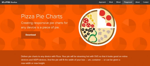
1. Pizza Pie Charts
Deliver pie charts to any device with Pizza. Your pie will be steaming hot with SVG so that it looks good on retina devices and HiDPI devices. And the pie will fit the width of your box – um, container – or can be given a max-width or max-height.
2. Visulize Free
Visualize Free is a free visual analysis tool based on the advanced commercial dashboard and visualization software developed by InetSoft. Visualization is the perfect technique for sifting through multi-dimensional data to spot trends and aberrations or slice and dice data with simple point-and-click methods.

3. Dipity
Dipity is a free digital timeline website. Users can create, share, embed and collaborate on interactive, visually engaging timelines that integrate video, audio, images, text, links, social media, location and timestamps. Dipity is the fastest and easiest way to bring history to life with stunning multimedia timelines.

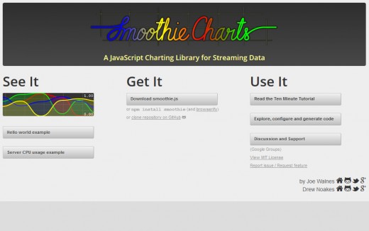
4. Smoothie Charts
Smoothie Charts is a really small charting library designed for live streaming data. Joe Walnes wanted to show real time streaming data pushed over a WebSocket. Although many of the charting libraries allow you to dynamically update data, none have really been optimized for a constant stream of data.
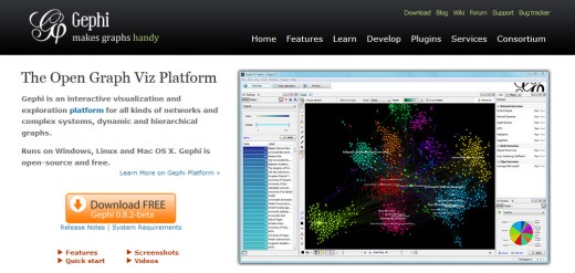
5. Gephi
Gephi is an interactive visualization and exploration platform for all kinds of networks and complex systems, dynamic and hierarchical graphs. Runs on Windows, Linux and Mac OS X. Gephi is open-source and free. Easy creation of social data connectors to map community organizations and small-world networks.
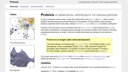
6. Protovis
Protovis composes custom views of data with simple marks such as bars and dots. Unlike low-level graphics libraries that quickly become tedious for visualization, Protovis defines marks through dynamic properties that encode data, allowing inheritance, scales and layouts to simplify construction.
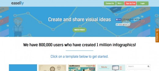
7. Easel.ly
Easel.ly is a simple web tool that empowers anyone to create and share powerful visuals (infographics, posters)… no design experience needed!
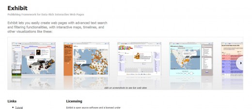
8. Exhibit
Exhibit lets you easily create web pages with advanced text search and filtering functionalists, with interactive maps, timelines, and other visualizations.
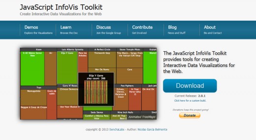
9. JavaScript InfoVis Toolkit
The JavaScript InfoVis Toolkit provides tools for creating Interactive Data Visualizations for the Web. The toolkit implements advanced features of information visualization like TreeMaps, an adapted visualization of trees based on the SpaceTree, a focus+context technique to plot Hyperbolic Trees, a radial layout of trees with advanced animations -called RGraph and other visualizations.
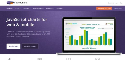
10. Fusion Charts
The most comprehensive JavaScript charting library, with over 90 charts and 900 maps. Stunning animation, rich interactivity and smart designs, you get it all with FusionCharts Suite. You’ll love showing it off. Give your users a powerful reporting experience with over 90 charts, built-in drill down, chart export, zooming and more.