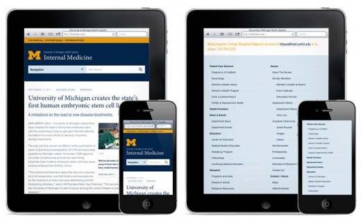
In a few month, responsive web design has become a very important part of designing and developing a website. The web is heading more and more towards mobile devices as the mobile phone and app trend rise. Responsive web design basically makes your website look great for desktop users at home, and mobile users on the go. So, here I’m featuring some of the best responsive web design tutorials found online that will help you to master responsive web design. Hope you will like them.
1. Adaptive Layouts with Media Queries
In this tutorial you will learn how to use adaptive layouts with media queries which affects browser dimensions.
2. Designing For A Responsive Web
Here’s an article that is not so much a tutorial as it is a guide to creating responsive web design.
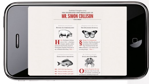
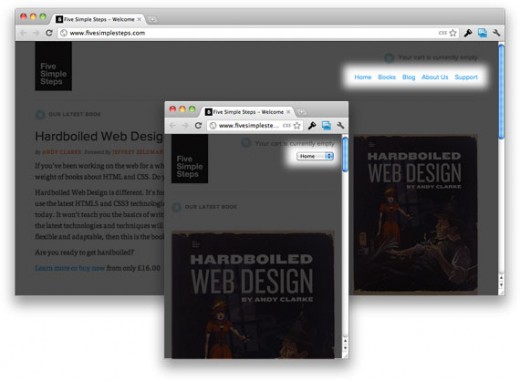
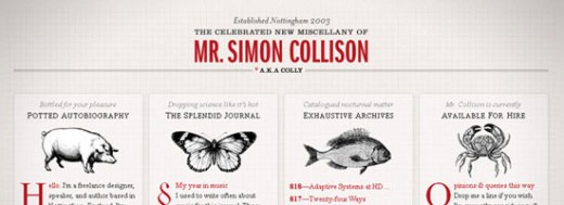
3. Responsive Web Design: What It Is and How To Use It
This is another nice overview of Responsive Web Design – has very in depth examples that explain concepts and guidelines on how to pull these things off.
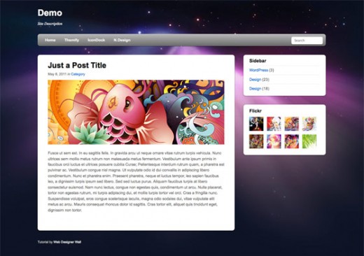
4. Create a Responsive Drupal Theme
Drupal themes enable you to change the look and feel of your site. In this tutorial you will learn that how to design a responsive Drupal theme.
5. Convert a Menu to a Dropdown for Small Screens
Chris Coyier will show you how to convert a menu to a dropdown for small devices.
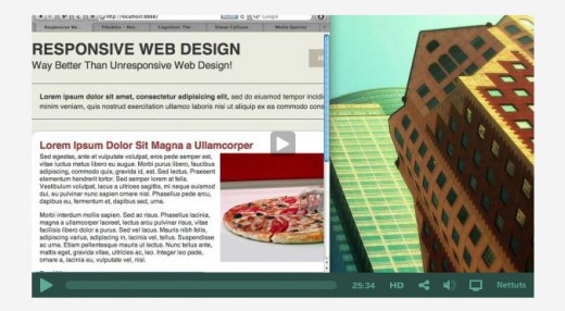
6. Responsive Web Design: A Visual Guide
If text-filled tutorials are not viable options, try this video tutorial instead. It is still rather technical but if it makes you feel better.
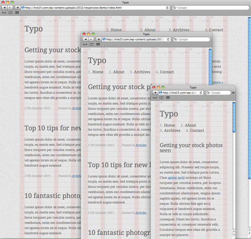
7. Create a Responsive Web Design with Media Queries
In this tutorial we’ll look at converting one of my previous WordPress theme designs into a responsive layout, while taking into consideration the design’s original grid structure.
8. How to Create a Responsive Website
I this tutorial you will learn that how to create a responsive website. This tutorial will only take about 15 minutes.

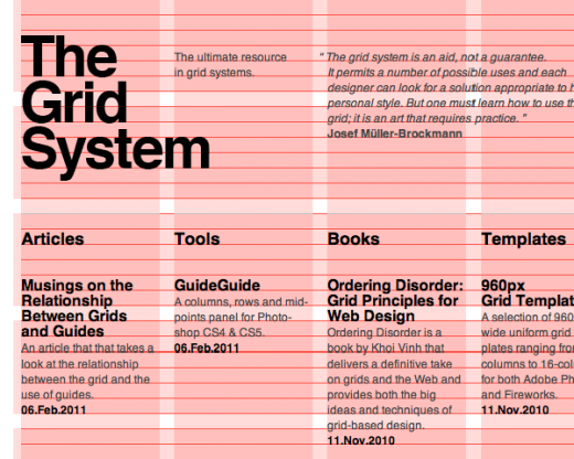
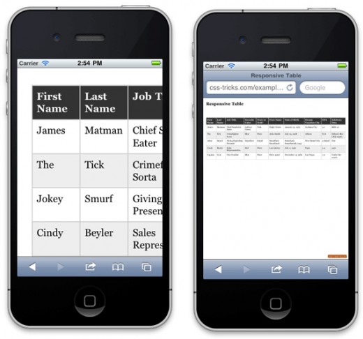
9. Responsive Data Tables
Create awesome tables that fits the display size? Chris Coyier from css-tricks.com have a very good post about the topic.
10. Understanding the Elements of Responsive Web Design
Learn the key features of a responsive web design: Flexible Grid, Flexible Images, Media Queries.
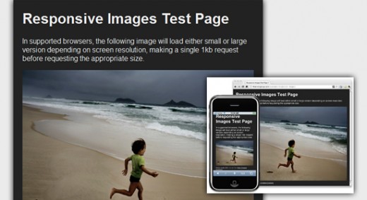
11. Use CSS3 Media Queries To Create a Mobile Version
In this article developer explain how, with a few CSS rules, you can create an iPhone version of your site using CSS3, that will work now.

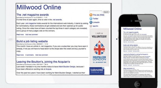
12. Scalable Navigation Patterns in Responsive Web Design
This tutorial talks about the lessons the author learned from a working on a large-scale responsive web design project.
13. Build a Responsive Site in a Week
In this tutorial you will learn that how to design a responsive website in week.

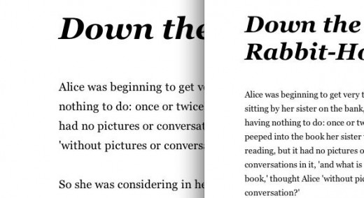
14. Handling Typography for Responsive Design
You’ve got your layout and images scaling, but you need to have your type following along as well.
15. Responsive Design with CSS3 Media Queries
This tutorial will show you how to create a cross-browser responsive design with HTML5 & CSS3 media queries.
While compiling this list, it’s always a possibility that I missed some other great resources. Feel free to share it with us.