A logo is a visual symbol which represents a company’s brand. Historically, logos were created and used to communicate the company’s product or service to people who were unable to read. Today, through the use of colors, graphics and fonts, a company‘s identity is most recognizable by its logo.
Here are 10 logos that are famous and the hidden meaning behind its creation.
1. IBM
![]()
Source: Wikipedia
The IBM logo consists for the letters “I” , “B”, and “M” in capital letters with horizontal stripes. The stripes represent dynamism and speed. Paul Rand replaced the stripes with solid letters in 1972. The equal sign in the lower right side of the logo is actually the equal sign which symbolizes equality.
2. Apple
![]()
Source: Wikipedia
Graphic designer, Rob Janoff, designed the Apple logo with a bite in it. The bite differentiated the apple from a tomato and a cherry. The bite also represented “byte”, which as a technical term, was appropriate for the tech company. A single design illustration was then created of a rainbow-striped apple. In 1998, Steve Jobs embraced the chrome and white apples which have a modern look. A popular rumor, which Janoff denies, states that the bitten apple symbolizes Adam and Eve in the biblical days and that Adam took a bite out of an apple from the Tree of Knowledge.
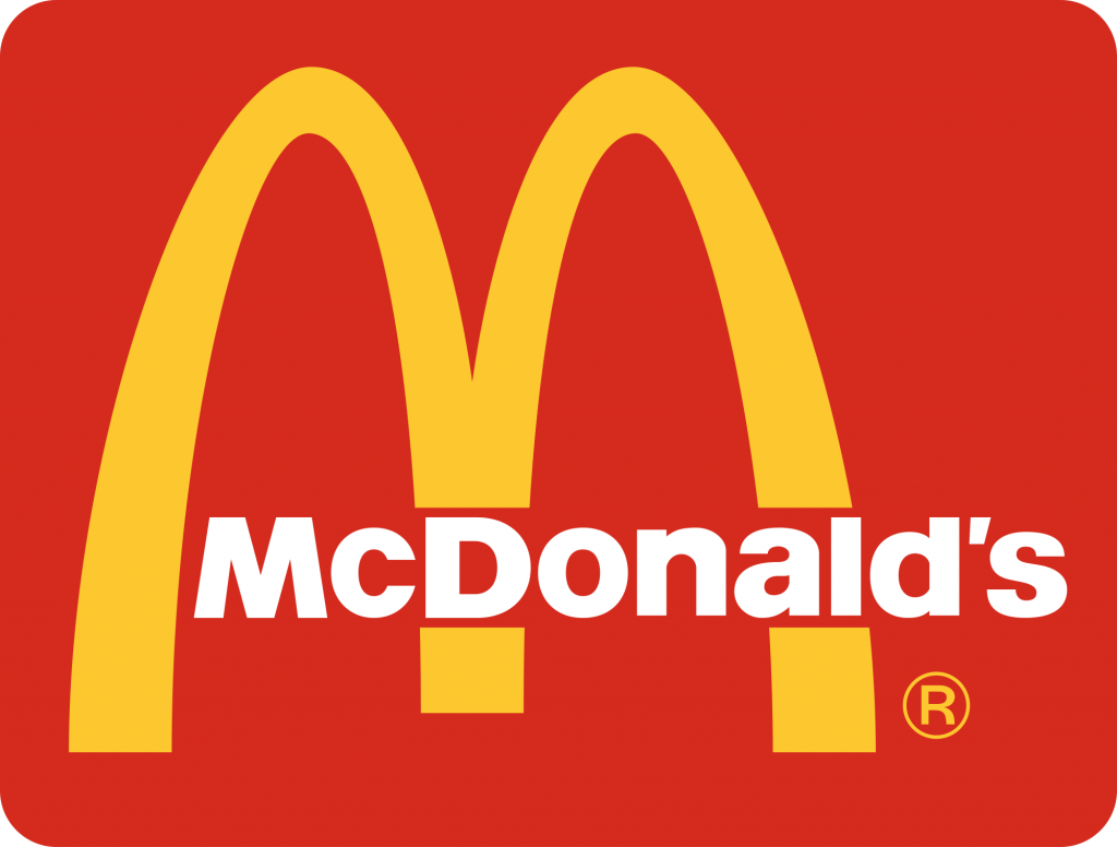
3.McDonalds
Source: Wikipedia
The yellow arches were originally part of the restaurant’s architectural design with an arch on each side of the building. In 1968, the golden arches became McDonalds logo because the overlapping arches resembled an “M”. Louis Cheskin, the design consultant, urged McDonald’s to keep the golden arches as the logo because they symbolized a pair of nourishing breasts.
4. Amazon
![]()
Source: Wikipedia
The Amazon logo has a yellow arrow starting at the “a” and ending at the “z”. This arrow means that Amazon sells everything from “a” to “ z”. The arrow resembles a smile demonstrating that shopping at Amazon will make customers happy.
5. BMW
![]()
Source: Wikipedia
The propeller design was accidental when BMW reversed the white and blue colors on their logo. The colors were reversed because they represented the colors of the Bavarian Free States which was illegal. Many believe that the circle with four quadrants represent a white plane propeller with a blue sky because BMW used to also create aircraft engines.
6. Baskin-Robbins
![]()
Source: Wikipedia
Well-known for offering 31 flavors, one flavor for each day of the month, Baskins-Robbins logo depicts a “BR”. If you look closely, the “BR” is also the number “31”. Baskin-Robbins logo was rebranded in 2005 to update its image.
7. Tostitos
![]()
Source: Flickr
Owner by FritoLay, the Tostitos dips and chips manufacturer has a logo with incorporates two humans. On top of the letter “I” is a tortilla chip dipped into some salsa in the “TIT”.
8. LG Electronics
![]()
Source: Wikipedia
.svg)
One of the main reasons the color red is used is because it attracts customers and symbolizes friendship. The LG symbol on the logo appears as a eye, nose and smiling face. According to LG, the circle represents not only the world, humanity, youth, future and technology, it also signifies LG’s goal to maintain commitment and close relationships with their global customers.
9. Volkswagen
![]()
Source: Wikipedia
The Volkswagen logo is a “v” sitting on top of the “w”. The “V” signifies “volks” which is the German word for people. The “w” is wagen which means car in German. It is the people’s car.
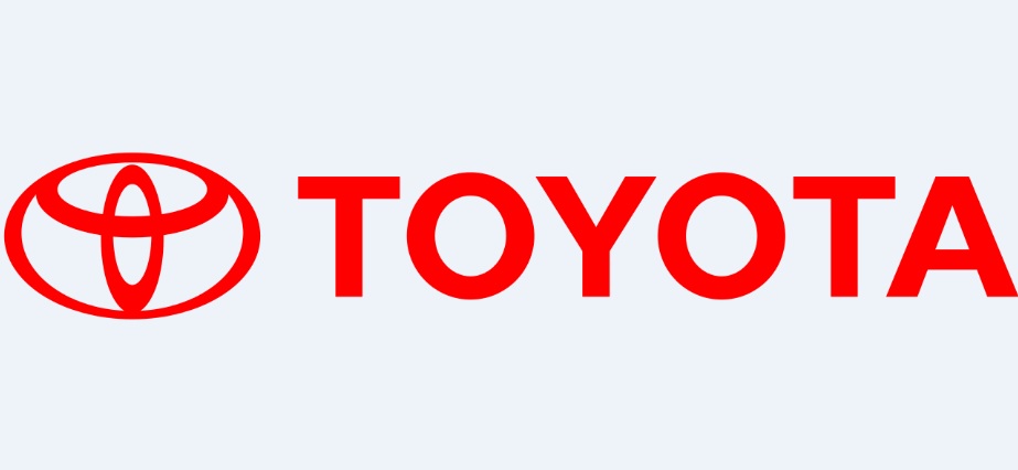
10. Toyota
Source: Wikipedia
Toyota’s logo consists of three overlapping oval shapes. Toyota claims that the three ovals “symbolize the unification of the hearts of their customers and the heart of Toyota products. The background space represents Toyota’s technological advancement and the boundless opportunities ahead.” Amazingly, the ovals spell the word “Toyota.”
The main ingredient of a successful logo is that it is immediately recognizable. Other elements of an effective logo are as follows:
• The logo is professionally created
• The logo is simple
• The logo is distinctive
• The logo is flexible
• The logo uses color appropriately
• The logo is based on the company’s target market
• The logo is not trendy but is timeless
These elements ensure that the logo is representative of your brand and communicates who you are and what you do.