With the average person receiving over 100 daily emails, inboxes have become a melting pot of personal, work, social, promotional, and newsletter emails. So how do you stand out among the hundreds of emails that flood your subscribers’ inboxes?
Well, you’ve come to the right place. In this blog, we’ll share five simple design tips that can help increase your newsletter engagement and excite your subscribers about your content. From using eye-catching visuals to optimizing your newsletter design for mobile devices, these tips are easy to implement and can make a big difference in long-term success.
So if you’re ready to take your newsletter to the next level, let’s dive in and explore these simple design tips that’ll help your newsletters stand out from the masses.
5 design tips to up your newsletter engagement
With so many emails vying for attention in your subscribers’ inboxes, it’s easy for your newsletter to get lost in the shuffle. That’s why creating a visually appealing design that stands out and captures your audience’s attention is the recipe for success.
Here are five design tips to help you create engaging, memorable, and shareable newsletters.
Design tip #1: Have a hierarchy of calls-to-action
Newsletters should have a clear call-to-action (CTA) that tells your subscribers what you want them to do next. But not all CTAs are created equal, and having too many competing CTAs can be overwhelming and confusing for your subscribers.
That’s why it’s crucial to have a hierarchy of CTAs that guide your readers toward the most important action you want them to take. Maybe you want them to register for a webinar. Or to read the most recent article published on your website. Or you need their answers to conduct a survey for an upcoming report.
You may even have a combination of these goals. So deciding on a single CTA can be challenging if you have multiple objectives. Fortunately, there’s some wiggle room in the “single CTA” rule for newsletters.
Why? Because newsletters read like digital newspapers, and readers want bite-sized information. So, you can have multiple calls-to-action embedded in your newsletter. For example, if you’re a local shop selling flowers in Fort Lauderdale, your primary CTA might be a “Buy Now” button that leads to a product page with seasonal floral arrangements. It should stand out prominently in the center of the newsletter.
Secondary CTAs could include “Shop New Floral Arrivals” and “Score 10% off the Perfect Bouquet,” which are visually distinct but less prominent than the primary CTA. You may also want to mix buttons and links across the primary and secondary CTAs.
Using a hierarchy of CTAs, this Fort Lauderdale flower shop can guide its subscribers toward the most important action for their business (i.e., making a flower purchase) while still providing them with other options and offers.
So how do you craft compelling CTA copy for your newsletter?
- Be direct and tell the readers exactly what they can expect
- Highlight the benefits
- Use a friendly tone – don’t be pushy or demanding
- Share an offer
- Create a sense of urgency
- Encourage an action
- Use wit or humor
- Spark a fear of missing out (FOMO)
Pro-tip: According to Mailmodo’s State of Email 2023 Report, 57.9% of actionable CTA copy worked best for marketers in 2022.
Design tip #2: Make the content scannable
Imagine: You’ve signed up for your favourite creator’s newsletter and are excited to receive their first newsletter on Tuesday. But, the first email you receive is text-heavy and features no white space, formatting, or images. You’re already running late for work and sadly have to pass on reading the newsletter that week.
The moral of the story? We’re all busy people. And sometimes we don’t have time to read every word. We want to scan for the information we’re most interested in. That’s why you should make your newsletter content scannable by breaking it into easily digestible chunks and using visual cues to guide your readers.
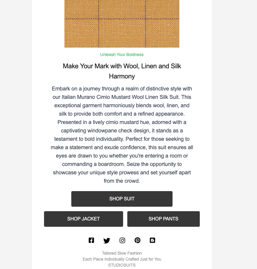
Take, for example, a newsletter from StudioSuits, a men’s clothing brand known for its quality suits, especially the double-breasted tuxedo. They use a very simple design in their newsletter, with images at the top and descriptions at the bottom, making it easier for readers to consume the content.
To format your email copy for readability, try the following:
- Use H2 and H3 headers to emphasize different parts of your email copy.
- Add white space to give your content room to breathe, making your newsletter look less cluttered and professional.
- Opt for bullet points or numbered lists to highlight key information or steps.
- Use images and visuals to break up text and make your newsletter more visually appealing.
- Incorporate emojis to add pizazz to specific sections.
Design #3: Keep the text short
Luxury Presence, a company specializing in designing property websites and helping real estate agents and teams thrive online, has found that newsletters are a fundamental resource in this industry. Agents that share emails with information related to market updates, education, and advice have engaged more with their community and clients. However, they recommend keeping the content short and to the point to boost newsletter engagement rates.
Why? Sometimes less is more. Instead of overwhelming your subscribers with a long and detailed email, focus on providing them with the most important information in a concise and engaging format.
Here’s how to do it:
- Get straight to the point and tell people about your main idea.
- Share teaser information with the audience and then link to your content asset (instead of elaborating on it).
- Make scannable lists and eliminate redundancy.
The less-is-more approach makes it easier for subscribers to digest your content. Plus, they’re more likely to read the entire email and take action. Luxury Presence also suggests using a short email subject line that aligns with the content of the email. You only have a few characters to catch your subscribers’ attention, so every word counts.
And a subject line is the determining factor of whether your email gets read or goes directly to the trash. Make a good first impression, and say hello to better open rates.
Design #4: Choose easy-to-read fonts and colors
Choosing the right fonts and colors can make or break your newsletter. Not only do they affect the readability of your content, but they also influence your newsletter’s overall look and feel. So, choose fonts and colors that are easy to read and visually appealing to keep your readers engaged until the very last word.
Let’s start with the fonts. Stick to clear and legible fonts, and avoid using fancy or cursive fonts that can be difficult to read. Sans-serif fonts like Arial or Helvetica are excellent choices for newsletters because they are simple, modern, and easy to read. Here are 30 awesome free fonts for your newsletter and other projects.
So what about colors? Color psychology can play a crucial role in how people perceive and respond to your newsletter. Why? Colors can evoke emotions and influence behavior, so choosing colors that match your brand and the message you want to convey is important.
For example, blue color is often associated with trust and reliability, making it a popular choice for corporate newsletters. Red is a powerful and attention-grabbing color, making it a great choice for calls to action or important announcements.
You should also consider the contrast between your text and background colors. Choose colors that contrast well to make your text easy to read.
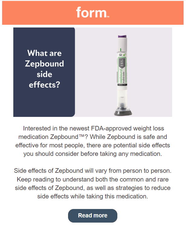
For example, take a look at this email from From Health talking about the Zepbound medication. Dark text on a light background or light text on a dark background helps improve readability.
However, when in doubt, use black text on a white background. Sometimes people have trouble reading in “dark mode.”
Design #5: Create a balance between images and text
During the newsletter design process, strike a balance between images and text. While images can make your newsletter more visually appealing, too many images can slow load times and make your newsletter look cluttered. On the other hand, too much text can be overwhelming and unengaging.
So have you ever heard of the 80–20 rule? If not, no worries! For this example, it’s achieving a balance of 80% text and 20% images to improve readability. The goal is to strategically add images to break up text and add visual interest. You should use high-quality images that are relevant to your content and will add context or value to your newsletter.
But optimizing your images for the web is also important, so they load quickly and don’t slow down your newsletter’s load time. That’s where vector graphics come in handy. These scalable images are mathematical equations rather than pixels. Unlike raster images, which are a grid of pixels and can become blurry or pixelated when scaled up.
Vector graphics are especially useful for logos, icons, and other small graphics commonly used in newsletters. Because they’re typically small files and can scale without losing quality, they’re ideal for improving load times and minimizing the impact on your newsletter’s overall file size.
Wrapping up
There you have it – five effective design tips to increase your newsletter engagement. Following these simple guidelines can make your newsletters more appealing, engaging, and memorable to your subscribers. Remember to keep your design simple, use visuals to break up the text, and make your call-to-action clear and prominent. With a little effort, you can make your newsletter stand out in a crowded inbox and keep your subscribers returning for more.
But don’t stop there. Keep experimenting with your newsletter design and content to see what resonates best with your audience. Continually improving your newsletters can build stronger relationships with your subscribers and drive more business success. So go ahead, try out these tips, and let us know how they work for you. Happy designing!