A service logo might be considered as a minor aspect to take into account, though it’s the very first thing which customers see. Would you really like your mobile platform to be popular? Then designing a logo is your primary task.
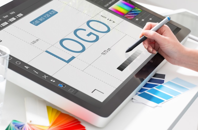
Take your platform logo seriously! The whole idea refers to design a service icon which is an extensive graphical sign for customers to communicate with each time they enjoy a specific online program. At the end of the day, it’s clear – nice and evocative icons guarantee app popularity. Do you want it to be YOUR app popularity?
Realizing such connection designers strive for creating a super efficient service icon in order to achieve their platform success. Anyway, before we get down specifically to hints to make a successful logo, we shall steal a little bit of your time to say a few words on what app icon really means.
What does an app icon stand for?
In short terms, an application icon refers to a little symbol of a particular mobile service which is represented on the App Store or Google Play. Such little sign purpose is to introduce a platform in the best possible light. Working on a logo from the decor point of view only isn’t good enough. Your mobile program icon shall reveal your service essence.

Sometimes people cannot see the difference between an app icon and a business logo. Those notions surely have similar features, however, given concepts are fundamentally different when we talk about developing approaches, instrument usage, and so on.
Shortly, a business logo, being a branding component, can be found on stationery and various ads types. And icons, in their turn, refer to square symbols in smartphones settings or on the main screen.
Actually, everyone can design a service icon using multiple editing programs, like, Photoshop and others. However, only experienced designers own the mystery of an efficient icon to gain customers’ sympathy.
Now let’s see how exactly to create an outstanding logo for your service. Interested?
Sometimes unprofessional developers while building product design might feel like their imagination has to be limited with logo small size. However, properly designed icons encourage users in applying the service. Are you ready to know the secrets of dreamy app logos? Here they come.
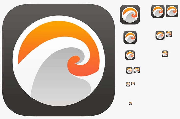
1. Being scalable
Think of it thoroughly. It’s vital to ensure your app icon – whatever size it would be – to express the core of your platform. Your purpose is making your logo scalable to look decent in various resolutions.
Excessive details will simply obstruct proper scalability, thus, the next tip is…
2. Minimalism
Try to avoid adding too many logo items which don’t serve any good purposes but decoration. A logo shall not be presented as a photo with too many unnecessary details, as in such a way when a small version icon is applied, it looks unclear and amorphous.
Your logo shall more recall a symbol. Make it clear and comprehensive. Concentrate on one item and… Do you still remember about scalability?

3. One-of-a-kind and relatable at the same time
Designing a logo shall comply with the overall platform type. Find a solution to distinguish yourself among similar market brands. A superb logo shall represent your intents, be attractive and full of creativity. Its ultimate purpose is to attract customers’ attention among multiple looking-alike symbols.
There isn’t one no-failure rule to ensure icon uniqueness and recognition. However, we would like to share with you some hints to assist you with that:
- Double and even triple check to ensure no other business has a similar icon. You might see some interesting examples, so figure out a path to adjust that idea to fit your requirements. Get your own way to the goal.
- Too many details will easily overload the audience brain, so the logo will never get to be well-recognizable.
- Make a few various sketches to conduct comparative analysis. That is to see what objects your eyes catch in the first place to adjust the final version.
- Play with colors to give a new look to your icon to differ it from similar designs.
- Have a look at market leaders’ logos. What makes them popular and remarkable?
4. Less words
Don’t stuff your logo with unnecessary words or phrases. Actually, a logo shall not present a service name. Its place is in the users’ interface. Amazing and special graphics presentation is much more critical.
A logo which “works” doesn’t need any words at all. It applies other means to interact with customers. In fact, while decreasing logo size, words turn to be indecipherable and look more like a colored blur.
You are surely free to add a little bit of text to your platform icon. It’s not forbidden. Nevertheless, multiple examples prove that a combination of text and pictures results in overloading and focusing loss. Thus, it takes more time and efforts for customers to capture specific message of yours.

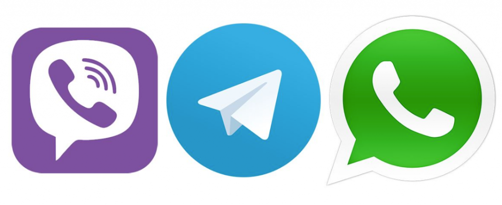
5. Color schemes matter
Experienced designers understand that coloring affects users’ perception. An icon shall include two contrasting color choices maximum. In case of applying more of them, you’ll hardly end up with a successful logo.
We recommend you ask yourself given questions in order to select your right color:
- Which coloring is better to underline your business brand personality?
- Which colors are to properly reveal your online service?
- Which colors do rivals prefer? We strongly advise you to find a way to differ from other marketplace players.
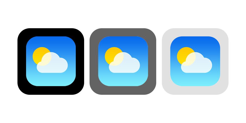
6. Background issues
In the majority of cases app stores present icons with a light-colored background only – whitish or greyish. However, gadget desktop wallpapers could be of different colors. Thus, it would be wise to see how a specific platform icon looks with different backgrounds.
7. Informativity
The most optimal path you can pursue in building really efficient program logo is to let it visualize your platform principle functionality. That sign shall explain users at a glance what the platform does.
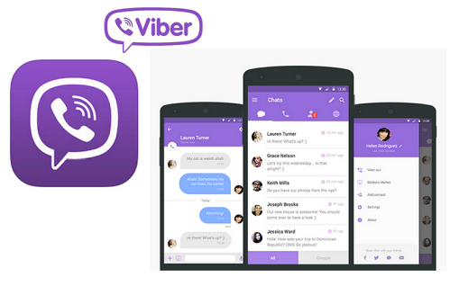
Developing a music service? Use some instruments and notes as an icon. A cloud image will perfectly work in case you have a chat platform. The only rule here is NOT to confuse customers misleading them.
8. Applying perspective
To come up with more notable icons, consider applying perspective advantages. Some designers would see the mentioned solution as a pretty courageous move. At the same time, to make it work in your favor make it relevant and appropriate.

9. Forget about photos
Don’t waste your precious time using color photographs as an icon. It won’t work. Photos and pictures will never make a proper logo. It’s not your way to go.

10. Coherence and consonance
Summing up all previous tips we’d like to emphasize how significant it is to ensure your platform logo to be not only unique and catchy but also harmonious and coherent to achieve your service most favorable customers’ perception. Matching an interface, your icon can easily strengthen specific brand concept, keep present customers and bring new bees.
Realizing such importance of an icon to your platform – even if at first it looks like something too small to pay attention to – you should devote due time to it. When you build a successful platform logo, you’ll call the attention even of those customers who visit AppStore and Google Play for completely other reasons without any intention to install any services.