The development of technology, especially devices like smartphones and tablets and big monitors introduced a new concept in web design – responsive web design, taking the next step of our responsive layout coverage.
I hope you will like this responsive frameworks collection as it is part of the responsive website basics that we feel are worth your consideration.
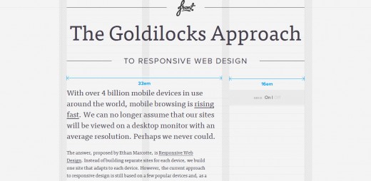
1. The Goldilocks Approach
It is a minimal framework that includes well commented CSS files that consider 3 CSS Media Query increments (multi column, narrow column and single column) and an HTML boilerplate file to get you started.
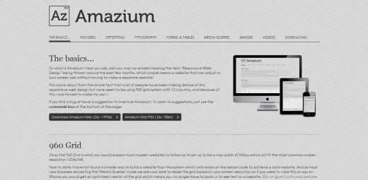
2. Amazium: CSS Framework For Responsive Sites
Amazium is a CSS framework that handles the most tricky and time-consuming parts of creating responsive websites.
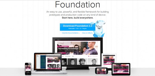
3. Foundation
Foundation is an easy to use, powerful, and flexible framework for building prototypes and production code on any kind of device. Foundation includes dozens of styles and elements to help you quickly put together clickable prototypes, that can then be adapted and styled into polished production code.
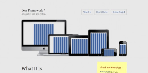
4. Less Framework
Less Framework is a CSS grid system for designing adaptive websites. It contains 4 layouts and 3 sets of typography presets, all based on a single grid.
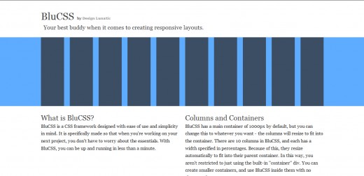
5. BluCSS – A CSS Framework For Responsive Layouts
BluCSS is a simplistic CSS framework which focuses on creating responsive layouts and has 4 built-in stages for these layouts: desktop, laptop, tablet, and mobile.
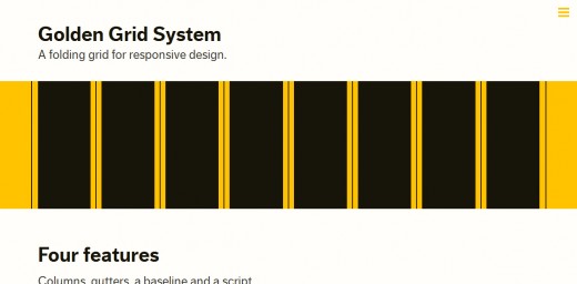
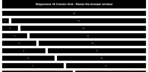
6. Golden Grid System
Golden Grid System (GGS) splits the screen into 18 even columns. The leftmost and rightmost columns are used as the outer margins of the grid, which leaves 16 columns for use in design.
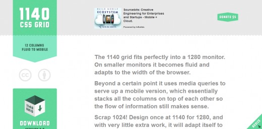
7. The 1140 CSS Grid
The 1140 grid fits perfectly into a 1280 monitor. On smaller monitors it becomes fluid and adapts to the width of the browser.
8. Titan Framework – A CSS Framework for Responsive Web Designs
With Titan Frameworkyou can create responsive layouts that adjust to any screen resolution at maximum width.
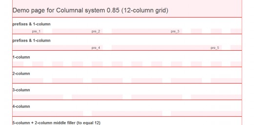
9. Columnal
Columnal makes responsive web design a little easier. It is 1140px wide, but since it is fluid, will respond to the width of most browsers.
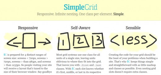
10. SimpleGrid
This CSS framework allows you to design sites compatible with differents devices and screen size.
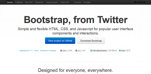
11. Bootstrap, from Twitter
Bootstrap is a toolkit from Twitter designed to kickstart development of webapps and sites. It includes base CSS and HTML for typography, forms, buttons, tables, grids, navigation, and more.
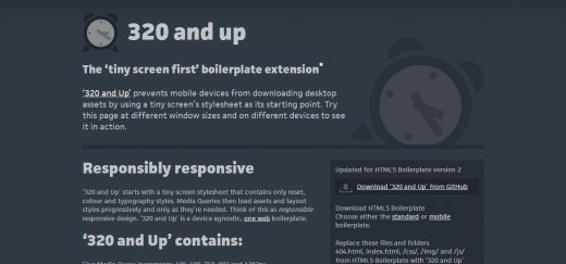
12. 320 and up
‘320 and Up’ prevents mobile devices from downloading desktop assets by using a tiny screen’s stylesheet as its starting point. Try this page at different window sizes and on different devices to see it in action.
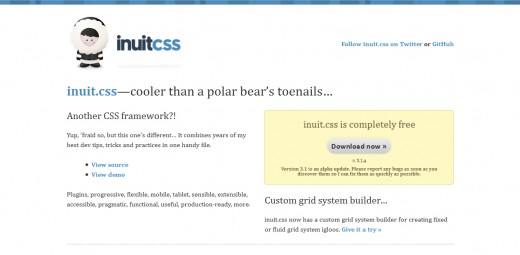
13. InuitCSS
inuit.css is a very stripped back framework designed to be built upon by you… no undoing things, and the minimum predefined styles.
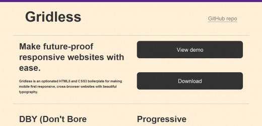
14. Gridless
Gridless is an optionated HTML5 and CSS3 boilerplate for making mobile first responsive, cross-browser websites with beautiful typography.
Share with us which framework did you use or which framework do you find it to fits better in design world.